
Container block
Place blocks side by side in columns, with optional spacing, border and background.
What it's for
A Container holds other blocks and arranges them in columns. Use it to put text next to a photo, show two or three cards in a row, or add a sidebar with a contact card next to an article. You can also use a one-column container just to give a group of blocks a background or border.
Add it to a page
- Open the page in the builder.
- In Add blocks, under Layout, drag Container onto the page.
- In the Settings panel on the right, choose Columns, for example 2 columns. Each empty column shows "Drop blocks here".
- Drag a block from Add blocks into a column.
- Drag more blocks into the columns. A column can hold several blocks stacked on top of each other.
To move a block that's already on the page into a column, drag it by its Move handle and drop it in the column.
Settings
Select the container to see its settings in the Settings panel on the right. To select it, click an empty spot inside it, or click Container in the Layers list. The container has no edit window; every setting is here and applies right away.
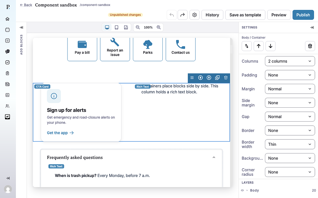
- Columns — how the container splits up. Options: 1 column (the default), 2 columns, 3 columns, 4 columns, Sidebar right (⅔ + ⅓) and Sidebar left (⅓ + ⅔). The sidebar layouts have one wide column and one narrow column.
- Padding — space between the container's edge and the blocks inside it. None (default), Tight, Normal or Roomy.
- Margin — space above and below the container. None (default), Tight, Normal or Roomy.
- Side margin — space to the left and right of the container. None (default), Tight, Normal or Roomy.
- Gap — space between the columns, and between blocks stacked in the same column. Tight, Normal (default) or Roomy.
- Border — a line around the container. None (default), Subtle or Strong.
- Border width — how thick that line is. Thin (default), Medium or Thick. It has no effect while Border is None.
- Background — a fill color behind the container. None (default), White, Subtle gray or Brand tint (a light tint of your city's brand color).
- Corner radius — how rounded the container's corners are. None (default), Rounded or Large. Most visible with a border or background.
Tips
- On phones, columns stack. Every container shows one column at a time on a phone, top to bottom: the first column, then the second, and so on. 2 columns and 3 columns sit side by side from tablet size up. 4 columns shows two across on tablets and four on large screens. The sidebar layouts sit side by side only on large screens. Use Desktop, Tablet and Mobile above the canvas to check.
- Put the most important column first. It's what phone users see first.
- A column holds blocks and other containers, but not a Collapsible. You can put a container inside a collapsible instead.
- Changing to fewer columns doesn't delete anything. Blocks from the columns that go away move into the last remaining column.
- To take a block out of a container, select it and click Move out of container in its toolbar. It lands right after the container.
- Use spacing settings, not empty blocks, to add room. Margin and Padding keep spacing even on every screen size.
Here's how a container with a CTA Card and text side by side looks on a public page:
